
Skyline – Basic Power BI Report – Part 3
This continues the work that we have been doing to create a basic Skyline Power BI report in part 1:
https://www.virtualworlduk.co.uk/wordp/?p=230985
and part 2:
Build the Visuals
If you’ve been following this series so far, then you will have seen us gather the data export from Skyline, create parameters and manipulate the data we took from Skyline as queries and measures in Power BI.
Now we are onto the stage of building the actual visuals, the method of showing the data we’re manipulating.
Title
We’ll start simple by creating a title for our report. For this we will go into the ‘Home’ menu item at the top of the screen and select the ‘Text box’ option.
When you click the ‘Text Box’ option, it will immediately create a text box in the Top Left hand corner of the screen. This is fine for now, as we can adjust it later. Click in the text box and type: Skyline Findings Summary
The text will appear quite small, so feel free to adjust the text size and colour as you wish. I used Segoe UI with a size of 28 and a dark blue colour (remember to swipe over your text before making changes). You can now use the handles around the edge of the text box to adjust the size of the box, and drag and drop the box to position it on the page. Alternatively, you can use the ‘Format’ functions on the right of the page to enter specific sizes and positions of the box. Under size, my box is set to: Height: 63, Width: 469
Under Position, my box is set to: Horizontal: 48, Vertical: 4
You should now have something similar to below:
Findings Box
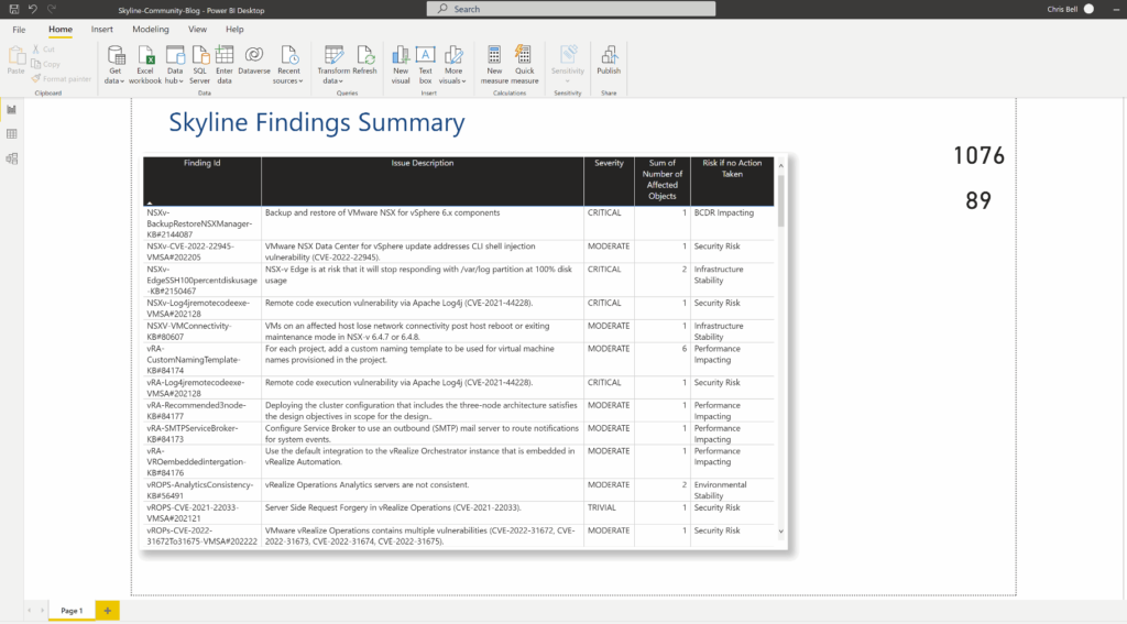
Let’s move onto something a little more complex now and create the central ‘Findings Box’.
This uses the ‘Table’ visual from the ‘Visualizations’ section on the right of the screen.
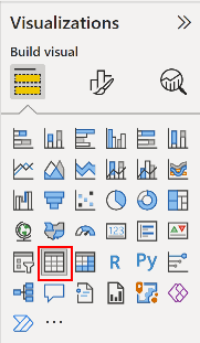
Clicking on the ‘Table’ option will create a blank table entry on the Power BI page, with text explaining to select or drag fields to populate this visual… so we’ll select some fields.
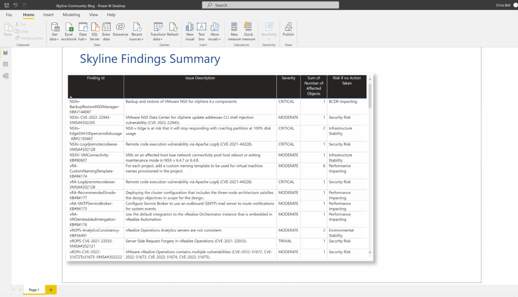
Expand the ‘Fields’ section on the right of the screen where we see the queries and measures we created previously. All of the fields we want to add to the table are taken from the ‘LatestFile’ query. Expand the ‘LatestFile’ query to show all of the fields underneath, then put a tick in each of the following fields in turn:
Finding Id
Issue Description
Severity
Number of Affected Objects
Risk if no Action Taken
You will see that the fields have expanded past the edge of the table and scroll bars have been added automatically. Also, the table doesn’t look the same as we have it in the target look, so let’s adjust it.
Let’s start with size and position, similar to how we did it before, except as this is a more complex visual, you need to switch across to the ‘Format Your Visual’ view under the ‘Visualizations’ section on the right of the screen.
Within that section, we also have ‘Visual’ and ‘General’, to modify the size and position, we’ll switch over to the ‘General’ page, then expand the ‘Properties’ item.
For my version, I created the Size as: Height: 574, Width: 939
For the Position, I have it as: Horizontal: 11, Vertical: 81
(please note that the Height may not seem right until you update the position details)
So, we now have a larger table on the report but it still doesn’t look the same, so let’s adjust the rest of the visual.
Whilst we are still in the ‘General’ section, lets go to the ‘Effects’ section and make sure that ‘Background’ is On and the background colour is White. We can then then go to the ‘Shadow’ section, make sure that it is On, the colour is Black, with an ‘Offset’ of: Outside, and a ‘Position’ of: Bottom Right.
This provides a shadow around the table and makes the background of the table white.
Next we need to switch back to the ‘Visual’ section to adjust some of the other settings.
Under ‘Style presets’ select: Condensed
Under ‘Grid’ make sure that ‘Horizontal gridlines’ is On, the colour is set to Grey and Width is 1.
‘Vertical gridlines’ should also be On, with colour set to Grey and Width set to 1.
Next we move onto the ‘Values’ section. Make sure that the font is set to ‘Segoe UI’ with the size being 9. Text colour should be Black and ‘Text wrap’ should be On.
Under ‘Column Headers’, the Font should be ‘Segoe UI’ with a size of 9. The Text colour should be White and the Background colour should be Black. The ‘Header Alignment’ should be centered and Text Wrap should be On.
Under ‘Totals’, this should be marked as Off.
We shouldn’t have anything to change in the ‘Specific Column’ section – but this is where you could change a certain column to have their data centered or in a different colour, if you wanted.
Unfortunately, there isn’t a way to specify the exact column width by a number in Power BI, and therefore you need to hover your mouse over the separator between the columns to then drag the width of the column accordingly. Repeat this process for each of the columns so that all of the data appears in the size of the table we have created without the need for scroll bars.
If you have a lot of findings being shown then you will not be able to get rid of the vertical scroll bar… this is expected. You should now have a page that looks similar to below:
Total Findings Available
As you can see, the report is now starting to take shape. We’re now going to focus on the ‘Total Findings Available’ visual at the top right of the report.
We’re actually going to focus just on displaying the numbers and we’ll tidy up the text boxes that are associated with these afterwards. I am aware that we can add text to a Card visual to avoid using a Text Box but this is an early version of my report that we are trying to replicate and this was the method used.
For this visual we are using the ‘Card’ visual.
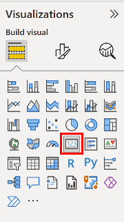
When you click the ‘Card’ visual, it will place a card on the page. Once again we are going to select a field to add to the card. This time we will select a field from the ‘TotalFindings’ query on the right. With the field that we are going to select being the ‘TotalFindings’ field – this should not have an icon next to it.
You will see that the visual will have a number and ‘First TotalFindings’ listed underneath. Let’s adjust the formatting of this (as it is also quite large). Switch across to the ‘Format you visual’ section under ‘Visualizations’
This time we’ll start on ‘Visual’ page. Under the ‘Callout value’ section, change the font to be: DIN with a size of 30 and colour being Black.
Under the ‘Category label’ section, make sure that this is Off.
Switch across to the ‘General’ page. Under ‘Properties’ make sure that the Size is set to: Height: 45, Width: 100
Position is set to: Horizontal: 1165, Vertical: 58
This should result in the card appearing in the top right of the screen and suitably sized
Your Findings
Now we are going to do a similar card but to show your active findings.
Start by creating a blank card as we have done previously.
For the field to select for this, we are going to use the ‘Your Findings’ field under the ‘TotalFindings’ query on the right.
This should provide a number and ‘Sum of Your Findings’ underneath.
We’ll now adjust the card to position it and adjust the size etc. as we did before.
Under ‘Visual’, for the ‘Callout value’ make sure that the Font is DIN and the size is 30, with a colour of Black. Under ‘Category label’ make sure that this is Off.
Switch to ‘General’, the Size should be: Height: 45, Width: 100
The Position should be: Horizontal: 1165, Vertical: 123
We should now have a page looking similar to below:
Total Pie Chart & Value
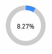
Now we’re going to move onto creating our first pie chart and calculation text. This pie chart will show the percentage of your findings against the total number of findings available.
We will be using the ‘Donut Chart’ visual for this.
If you click on the ‘Donut Chart’ option it will put a blank chart on the report similar to the others we have done.
Let’s start by adding the fields. Both fields will be coming from the ‘TotalFindings’ query and you should click the fields in the following order:
Your Findings
Other Findings
Keeping this with the default settings looks completely different to the look we are trying to create and therefore let’s go through and adjust the look and settings.
Switch to ‘Format you visual’ and under the ‘Visual’ section make sure that Legend is Off and that Detail labels are also Off.
Under ‘Slices’ you should make sure that ‘Your Findings’ is coloured in Light Blue and that ‘Other Findings’ is coloured in Grey. You should also expand the Spacing section to make sure that the Inner Radius is set to 77px. This will adjust the thickness of the donut.
If we now switch over to the ‘General’ page, we can adjust the Size to be: Height: 187, Width: 194
The Position can then be adjusted to be: Horizontal: 976, Vertical: 4
Moving down, Title should be switched to Off. Under Effects, Background should be switched to Off.
To finish off this chart, we just need to put the percentage in the middle. The percentage figure actually uses a ‘Card’ similar to before and therefore click on the ‘Card’ option to create a new card on the report.
The field that will be used for this card is under the ‘TotalFindings’ query and is called: %TotalFindings
Once selected, switch to ‘Format you visual’, under ‘Callout Value’ select the font as DIN with a size of 20, colour Black.
Make sure that ‘Category label’ is Off.
Under the General page, we want to set the Size to: Height: 35, Width 101
Position should be set to: Horizontal: 1022, Vertical: 81
You should now have a donut pie chart showing with a percentage figure in the middle. We’ll now repeat the process for the Critical, Moderate and Trivial donut charts.
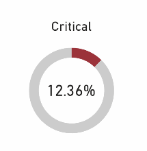
Critical Pie Chart & Value
Once again we are going to use a ‘Donut Chart’, so select this from the ‘Visualizations’ sheet.
We will be using two fields from the ‘TotalFindings’ query for this chart and therefore select the following fields in the displayed order:
Critical
CriticalLeft
Switch ‘Format you visual’ to adjust the configuration of the donut chart. Make sure that Legend and Details Labels are both set to Off.
Under Slices, make sure that Critical is a Red and CriticalLeft is a Grey, then go into Spacing and make sure the Inner Radius is 77 px.
Switch to the ‘General’ page and make sure that the Size is as follows: Height: 168, Width: 177
Then make the Position: Horizontal: 1031, Vertical: 317
Move down to the ‘Title’ option, make sure that it is On. Under the Text box, enter: Critical
Make sure that the Heading is: Heading 3
Font should be DIN with a size of 14, colour should be Black and it should be Centered.
Make sure that Header icons and Tooltips are Off, along with Background under Effects being set to Off.
For the percentage in the centre, we’ll use a ‘Card’ again and therefore click that to create a new card.
The field we are going to use for this is under the ‘TotalFindings’ query and is called: %Critical
Format the visual, the Callout value should have a font of DIN with a size of 17, colour Black. The Category label should be Off.
Under ‘General’, the Size should be: Height: 34, Width: 102
Position should be: Horizontal: 1068, Vertical: 393
Make sure to go under Effects to switch the Background to Off.
You should now have a Critical donut chart created.
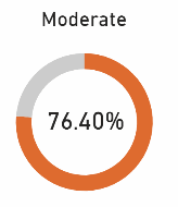
Moderate Pie Chart & Value
Now we’ll repeat the same process as before but for the Moderate results.
Insert a new donut chart as before. The fields to be added to this chart are from the ‘TotalFindings’ query and are:
Moderate
ModerateLeft
Make sure that Legend and Detail labels are Off. Under Slices, choose an Orange colour for Moderate and Grey for ModerateLeft, under Spacing make sure that the Inner Radius is 77 px.
Under ‘General’, set the size to be: Height: 170, Width: 177
Position: Horizontal: 958, Vertical: 485
Under Title, make sure the Text says: Moderate
Heading should be: Heading 3
Font should be DIN with size 14, text colour should be Black and it should be centered.
Under effects, make sure that Background is Off.
To add the percentage figure in the centre, we’ll use another ‘Card’, therefore click that to create a new Card.
The field for this one is: %Moderate
Under Visual, change the Callout value to make sure it is Font of DIN, size 17, colour Black. Make sure Category Label is Off
Under General, make the Size: Height: 34, Width: 102
Position should be: Horizontal: 996, Vertical: 561
Under Effects make sure that Background is Off.
You should now have a Moderate donut created.
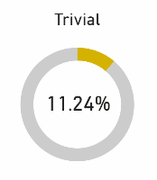
Trivial Pie Chart & Value
The final donut chart we are going to create is for the Trivial findings. Once again, click the Donut Chart option to insert a new donut chart.
The fields used on this chart are from the ‘TotalFindings’ query and are:
Trivial
TrivalLeft
Under Visual, make sure that Legend and Detail labels are Off.
Under Slices, choose a Dark Yellow for Trivial and a Grey for TrivialLeft
Make sure to change the Spacing so that Inner Radius is 77px.
Under General, the Size should be: Height: 170, Width: 177
Position should be: Horizontal: 1103, Vertical: 485
Under Title, make sure the Text is: Trivial
The Heading should be: Heading 3
Font should be DIN with a size of 14, colour Black and centered.
For the percentage information, we are going to use a ‘Card’ so select that as we’ve done before.
The field to use is taken from the ‘TotalFindings’ query and is called: %Trivial
Under Visual, the Callout value should have font of DIN, size 17, colour Black.
Category label should be Off.
Under General, the size should be: Height: 34, Width: 102
Position should be: Horizontal: 1141, Vertical: 561
Under Effects make sure to switch Background to Off.
You should now have a Trivial donut chart created.
Your report should now look similar to this:
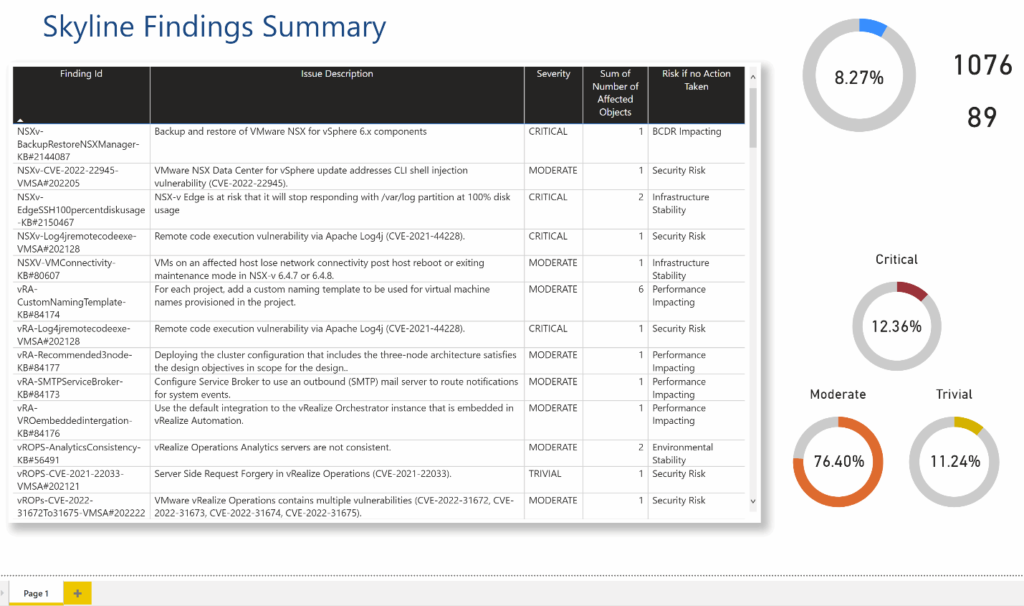
Your Findings Trend
The last of the charts that we are going to add to the report is the ‘Your Findings Trend’ chart. This is a line chart that will show how the number of findings in your environment is changing over time. When you have more than one Skyline exports in your export folder then it will show a line, with just a single export it will only show a dot for where you are.
As mentioned we’ll use the ‘Line Chart’ visual for this and therefore select this from the ‘Visualizations’ pane.
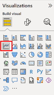
For a line chart we need to provide a field for the X-axis and one for the Y-axis. Rather than just clicking the relevant field, we are going to drag and drop the field to the relevant part of the line chart inputs.
Both elements are going to come from the ‘FindingsCount’ query. First up we will drag and drop the ‘Date’ field across to the X-Axis. When it is there, we will click the ‘X’ next to Year and Quarter to keep just the Month and Day visible.
We’ll now drag and drop the ‘Count’ field across to the Y-Axis. At this point you should now see a dot in the centre of the line chart along with Months, Days etc., we’ll sort those out next.
Under Visual, we’ll make sure that X-axis, Y-axis and Secondary y-axis are all Off. Within each of those items, also make sure that Title is switched to Off.
Under General, we want the Size to be: Height: 65, Width: 275
Position should be: Horizontal: 975, Vertical: 217
Title should be Off.
You should now has a line chart on your report… admittedly at this point it will just look like a dot on the page. You page should now look similar to below:
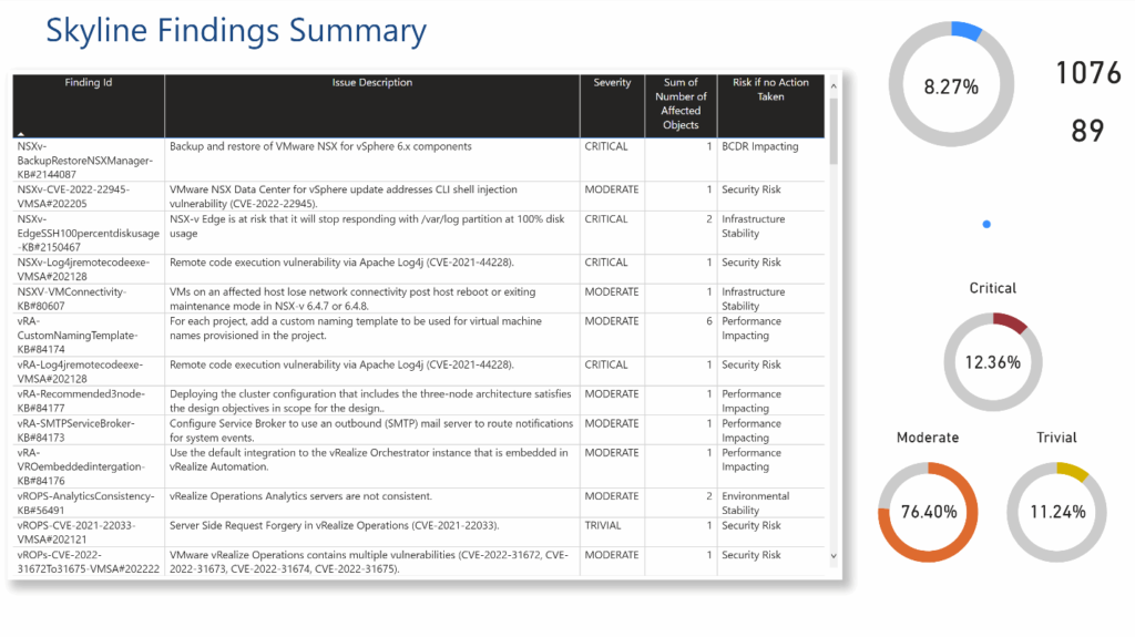
Final Text Boxes
The final item as part of our page design is to add in some final text boxes to help identify some of the things being shown. For each of these, click to create a new Text box, then use the details below to adjust them to the right text, text box size and position.
- Text: Critical Findings Summary:
Font: Segoe UI
Font Size: 10
Height: 29
Width: 177
Horizontal: 13
Vertical: 56 - Text: Total Findings Available:
Font: Segoe UI
Font Size: 10
Text Position: Centered
Height: 76
Width: 102
Horizontal: 1163
Vertical: 22
Effects, Background: Off - Text: Your Findings:
Font: Segoe UI
Font Size: 10
Text Position: Centered
Height: 51
Width: 126
Horizontal: 1154
Vertical: 109
Effects, Background: Off - Text: Your Findings Trend
Font: Segoe UI
Font Size: 10
Text Position: Centered
Height: 30
Width: 137
Horizontal: 1050
Vertical: 201
Effects, Background: Off
You should now have your full report looking similar to below:

Adding More Exports and Updating Report
As you want to start showing how the number of findings are changing over time, you’ll want to have more export files added into the export folder at the beginning. Go into Skyline Advisor as we did initially and export the files and make a note of the total number of findings.
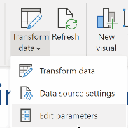
Come back into your Power BI report, click the down arrow on the ‘Transform data’ link at the top of the screen and select ‘Edit Parameters’. From here you can adjust the file location, if you need to, and can update the total number of findings gathered from Skyline.
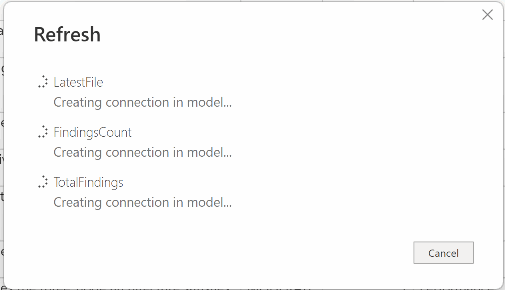
With the export files in the correct folder and the figures updated, you can then click the refresh button at the top of the screen to refresh all of the visuals using the new information.

As mentioned at the beginning this is a basic report to get you started but with this basis, you can develop the report in many different ways.
I’m interested to see what additional ways you may have to develop this report in the future. Post a comment to let me know how you get on.